Photoshop Color Settings

Photoshop Color Settings
Working Space
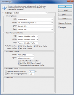
Working space is how Photoshop refers to its default color spaces. We tell Photoshop what to use as the default color spaces in its Color Settings dialog box as seen in Figure 1. This dialog box is accessed by clicking Edit > Color Settings. We can set up to four default color spaces. One for RGB, one for CMYK, one for Grayscale and one for Spot. Whether or not Photoshop automatically assigns the default color space to an image is based on how we set up the Color Management Policies in the Color Settings dialog box.
Color Management Policies
The Photoshop Color Management Policies tell Photoshop whether or not to use the color profile embedded in an image and what to do if the embedded profile is different from the working space profile. It can also forewarn us if an image does not have an embedded profile.
Converting Color Spaces
If we need to change an image's color space, we convert it from one color space to another using Photoshop's Edit > Convert to Profile and then save the image so the new profile gets embedded with the image.
The fact that two color spaces are involved means there are two color gamut's involved. This means one set of predefined colors is being converted to another. By definition, no two color gamut's are the same. (If they were, why bother having a second one?) Therefore, in any two different color spaces, one will have colors the other does not. If a color exists in the original, or source, color space but not the destination color space, then Photoshop (or any other image editing software) needs to know how to convert the mismatched color. We set these options in the Conversion Options section of Photoshop's Color Settings dialog box.
Conversion Options: Engine
The Engine option tells Photoshop what software will handle the conversion. I leave mine set to Adobe.
Conversion Options: Rendering Intent
Colors in the source color space that are not in the destination color space are known as out of gamut colors. The Rendering Intent option tells the color conversion engine how to handle out of gamut colors. There are four options.
- Perceptual. If out of gamut colors are encountered, then the Perceptual intent will shift both in gamut and out of gamut colors so as best to preserve the visual relationship between the colors while remapping out of gamut colors to a color that is in gamut in the destination color space.
- Saturation. Converts the image's colors to highly saturated in gamut colors in the destination color space. I do not recommend the Saturation intent for photographers. It is more appropriate in graphics where color accuracy is not critical.
- Relative Colorimetric. For in gamut colors, maps color to color between source and destination color spaces. For out of gamut colors, remaps the color to the closest in gamut color. Maps source white to destination white.
- Absolute Colorimetric. For in gamut colors, maps color to color between source and destination color spaces. For out of gamut colors, remaps the color to the closest in gamut color. Does not remap source white to destination white but rather converts white as a color, so whites may look different once converted to the destination color space.
Most photographers use either the Relative Colorimetric or Perceptual intent. Perceptual attempts to maintain color relationships over consistency while Relative Colorimetric strives to maintain color consistency.
Conversion Options: Black Point Compensation
Tells the conversion engine whether or not to adjust for any differences in black between the source and destination color spaces. If turned on, the full range of the source and destination color spaces are used during the conversion. If turned off, black and other dark colors can appear muddy. I cannot think of a reason as to why this option should be turned off.
Conversion Options: Dithering
When processing out of gamut colors in an 8-bit per channel image, it tells the engine to combine colors in the destination color space in such a way as to best represent the out of gamut color. Can help minimize posterization but can also lead to larger file sizes. The Channels and Bit Depth page explains bit depth.
Color Settings Video Tutorial

Using Photoshop For Photo Restoration
Digital photo restoration can save irreplaceable heirloom pictures and preserve an important part of your family history. Whether it be a torn edge, damaged corner, creases, cracks, water stains or rips and tears, Iridis Imaging provides an expert restoration service to return your photos to their original glory.
Using the most sophisticated computer software, the results that can be achieved are quite astonishing. No matter how badly the extent of the damage to your photo an improvement is almost always possible and in most cases a total restoration to the photos original quality.
Photo Restoration Example - Before And After

wooden letters - wooden letters and wooden shapes
wooden letters
Wooden Letters and Wooden Shapes
- Photo Restoration
Please check out this amazing website selling wooden letters and wooden shapes. They have a wide range of products from wooden disney characters to wooden nursery letters and wooden nursery shapes. They also have the widest range of wooden letters on


